Introduction
In a digital landscape often dominated by minimalism and clean interfaces, a radical aesthetic is emerging and shaking up conventions: Neubrutalism. This movement, which draws its roots from brutalist architecture of the 1950s, is now establishing itself in interface design by valuing the raw, the bold, and the unexpected.
For UX/UI designers, mastering this trend is not just a matter of style; it's an opportunity to create memorable and distinctive experiences in a saturated market.
Neubrutalism is characterized by its rejection of smooth finishes and artificial perfection. It relies on garish color palettes, asymmetric grids, and an "unpolished" appearance that catches the user's attention. In a context where attention is a scarce resource, this approach can capture the eye and reinforce brand identity.
> Key Lesson: Neubrutalism is not synonymous with disorder. Its effectiveness relies on a deliberate balance between visual boldness and readability, made possible by meticulous planning in Figma.
Understanding Neubrutalism: Beyond the Raw Aesthetic
Origins and Architectural Inspiration
Neubrutalism draws its inspiration from brutalist architecture, which emphasized raw materials like concrete, without embellishments. Transposed into digital design, it translates into a "raw" and unfiltered aesthetic, where imperfection becomes a strength.
Fundamental Differences with Minimalism
Unlike minimalism, which seeks to simplify the interface to the maximum, Neubrutalism embraces complexity and heterogeneity. It can integrate elements such as:
- Thick borders and pronounced ones
- Exaggerated drop shadows
- Bold typography that defies standards
- Asymmetric compositions deliberately unbalanced
Strategic Value of Neubrutalism
This approach is not just an aesthetic whim; it responds to a growing need for authenticity and differentiation. Users, accustomed to sanitized interfaces, can be intrigued and engaged by a design that dares to break away from the beaten path.
The Fundamental Pillars of Neubrutalist Design
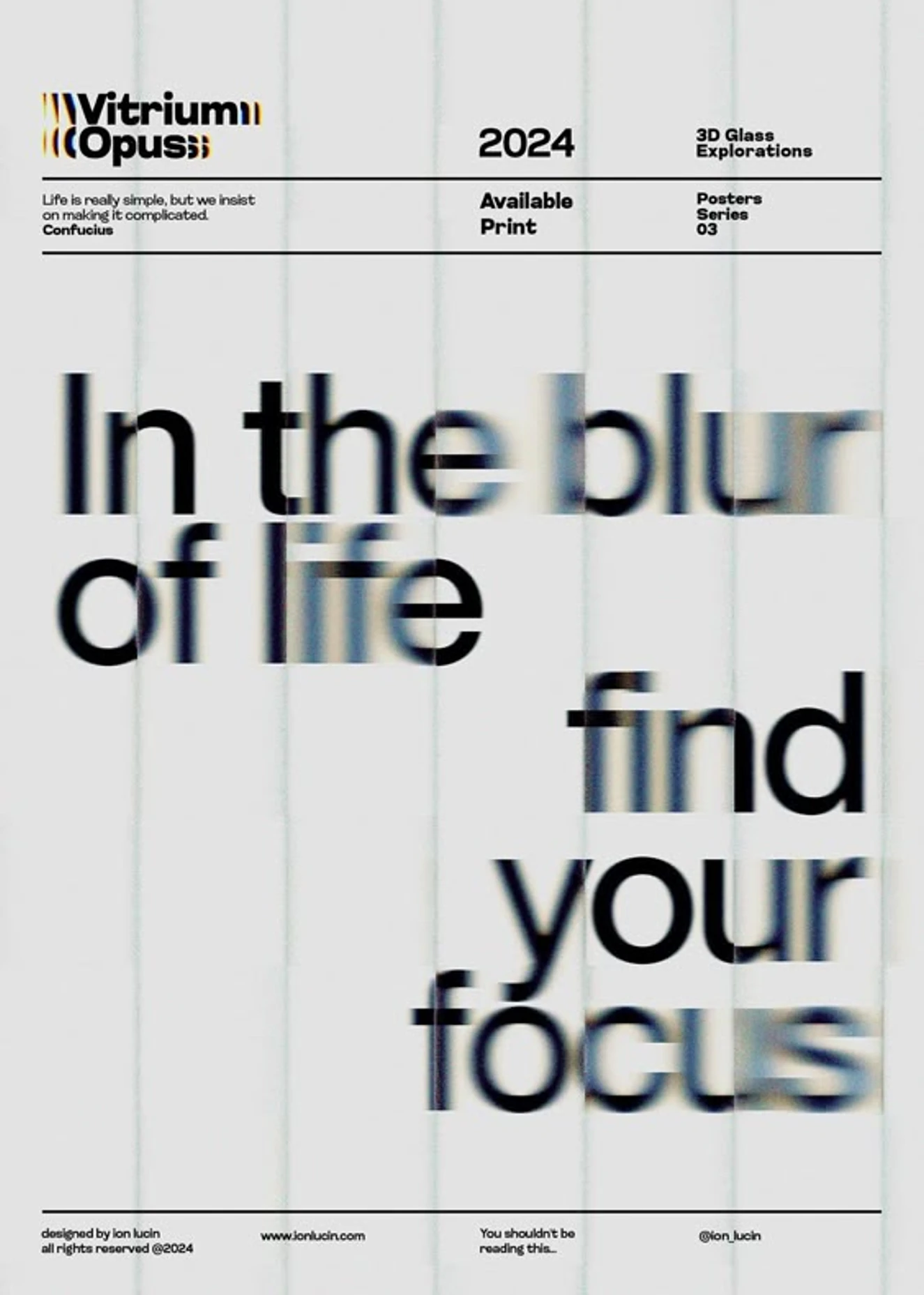
Bold Color Palettes
Neubrutalism favors combinations of bright and sometimes dissonant colors that attract attention and create a strong visual identity. These characteristics include:
- Saturated and vibrant hues
- Marked contrasts for a striking effect
- Unusual combinations that defy conventions
- Primary colors used aggressively
Unconventional Grids and Layouts
Abandon symmetrical and rigid grids. Neubrutalism embraces asymmetry and unpredictable layout structures, which can make the interface more dynamic and engaging.
Expressive Typography
Bold and sometimes irregular fonts are common, serving to reinforce the "raw" character of the design while guiding the user's eye.
Distinctive Interactive Elements
Interactive components feature unexpected styles:
- Buttons with thick borders
- Exaggerated hover effects
- Simple but impactful animations
- Strongly contrasted visual states
Implementing Neubrutalism in Figma: Step-by-Step Guide
Design System Setup
Start by defining your basic elements in Figma:
- Color styles for your bold palettes
- Expressive and bold typography
- Reusable components for buttons and cards
- Standardized effects and borders
Creating Custom Grids
Figma allows creating custom grids. Test unconventional structures:
- Broken grids for a dynamic effect
- Unexpected alignments that surprise the user
- White spaces used strategically
- Intentional overlays of elements
Using Effects and Borders
Incorporate characteristic visual elements:
- Pronounced drop shadows
- Thick and visible borders
- Texture effects to reinforce the raw aesthetic
- Slight distortions for an organic look
Prototyping Interactions
With Figma's prototyping tools, simulate how elements respond to actions:
- Simple but impactful animations
- Transitions that reinforce the brutal identity
- Immediate and exaggerated visual feedback
- Surprising micro-interactions
Challenges and Best Practices of Neubrutalism
Maintaining Readability
One of the main pitfalls is readability. To address this:
- Sufficient contrast between text and background
- Testing in different lighting conditions
- Clear visual hierarchy despite the bold style
- Font size adapted to high contrast
Ensuring Accessibility
A too heterogeneous design can pose accessibility problems:
- Check contrast ratios with integrated tools
- Ensure keyboard navigability
- Respect web accessibility standards
- Test with screen readers for validation
Avoiding Sensory Overload
To prevent visual fatigue:
- Balance between bold elements and rest spaces
- Consistency in apparent disorder
- Early user testing to validate the experience
- Strategically placed breathing zones
Competitive Advantages of Neubrutalism
Marked Differentiation
In a market saturated with similar interfaces, Neubrutalism offers:
- Immediately recognizable visual identity
- Increased memorability of the user experience
- Strong and distinctive brand positioning
- Instant recognition among competitors
Enhanced User Engagement
The brutal approach can generate:

- Curiosity and exploration of the interface
- Stronger emotional connection
- Improved engagement rate thanks to surprise
- Increased social sharing of remarkable interfaces
Concrete Application Cases in Figma
Landing Page Design
Creating a homepage in Neubrutalist style:
- Asymmetric header with element overlays
- Oversized buttons with thick borders
- Sections with contrasting and vibrant colors
- Unconventional but functional navigation
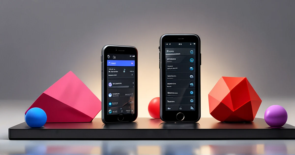
Mobile App Design
Adapting Neubrutalism for mobile:
- Flexible grids adapted to touch screens
- Exaggerated but intuitive touch interactions
- Visual hierarchy preserved despite boldness
- Performance maintained despite visual effects
Practical Examples of Figma Components
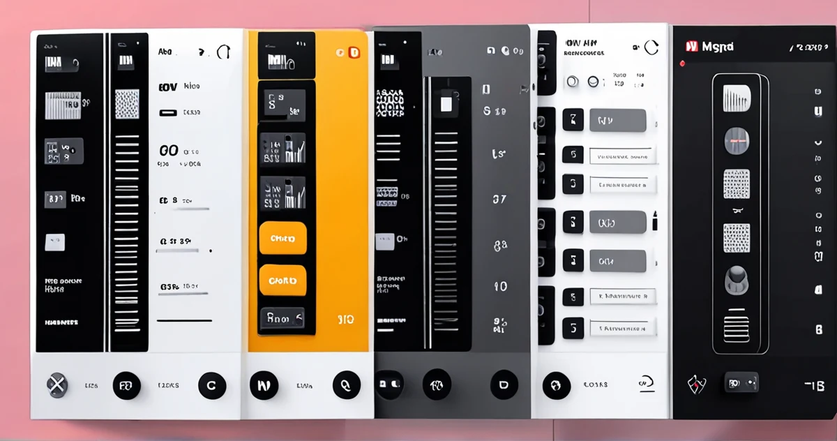
Reusable Component Library
Create an organized library in Figma with:
- Primary buttons with 4-6px borders
- Content cards with marked right angles
- Section headers with expressive typography
- Navigation elements with geometric shapes
Optimized Color System
Organize your palettes in Figma with:
- Saturated and contrasted primary colors
- Gray shades for texts and backgrounds
- Accent colors for interactive elements
- Status palettes for alert messages
Optimized Design Workflow
Preliminary Planning
Before starting in Figma, clearly define:
- Specific design objectives for the project
- Target audience and their expectations
- Technical constraints to respect
- Inspiring visual references
Iterations and Validation
Adopt an iterative approach to refine your design:
- Rapid prototypes to test concepts
- Regular user feedback
- Progressive adjustments based on feedback
- Final validation with comprehensive tests
Design Style Comparison
| Characteristic | Neubrutalism | Minimalism | Skeuomorphism |
|---------------------|-------------------|-----------------|-------------------|
| Color Palette | Bright, saturated, contrasted | Neutral, limited | Natural, realistic |
| Typography | Bold, expressive, irregular | Simple, clean | Elegant, detailed |
| Structure | Asymmetric, broken | Symmetric, organized | Organic, realistic |
| Visual Elements | Thick borders, pronounced shadows | Fine lines, subtle shadows | Textures, realistic gradients |
| Accessibility | Challenge with high contrast | Easy with controlled contrast | Variable depending on implementation |
Advanced Implementation Guide
Style Configuration in Figma
To optimize your Neubrutalist workflow in Figma:
- Create color styles with consistent names (Primary, Secondary, Accent)
- Define text styles for each hierarchical level
- Establish components for recurring elements
- Organize your library with clear sections
Advanced Composition Techniques
Master these techniques for impactful Neubrutalist designs:
- Element overlays with controlled transparency
- Use of masks for complex geometric shapes
- Combination of multiple grids for a dynamic effect
- Component animation with bold transitions
Common Mistakes to Avoid in Neubrutalism
Excessive Visual Overload
Avoid these common pitfalls:
- Too many elements competing for attention
- Colors too aggressive that tire the eyes
- Confusing or unreadable visual hierarchy
- Lack of rest spaces between elements
Neglect of User Experience
Keep these principles in mind:
- Functionality before aesthetics - design must serve the user
- Intuitive navigation despite disruptive appearance
- Optimized loading times despite effects
- Multi-device compatibility rigorously tested
Inspiring Neubrutalism Projects
Successful Examples in Digital Design
Discover successful implementations of Neubrutalism:
- Designer portfolios using saturated colors and broken grids
- Web applications with deliberately disruptive interfaces
- Landing pages that capture attention through visual boldness
- Mobile interfaces that challenge ergonomic conventions
Concrete Case Studies
Analyze how these projects succeeded in their implementation:
- Contrast strategy to maintain readability
- Visual hierarchy preserved despite asymmetry
- Performance optimization with visual effects
- User testing to validate the overall experience
Neubrutalist Validation Checklist
Before finalizing your design in Figma, check these essential points:
- ✅ Color contrast sufficient for readability
- ✅ Clear visual hierarchy despite asymmetry
- ✅ Intuitive navigation preserved
- ✅ Performance optimized for all devices
- ✅ Accessibility tested and validated
- ✅ Consistent and distinctive visual identity
Optimization Strategies for Neubrutalism
Performance Optimization in Figma
To ensure optimal performance despite complex visual effects:
- Use components to reduce duplication
- Optimize images and graphic resources
- Limit real-time effects on complex prototypes
- Test on different devices to validate performance
Integration with Team Workflows
Adopt these best practices to collaborate effectively:
- Create clear documentation for your design system
- Train your team on Neubrutalism specifics
- Establish consistent naming conventions
- Use team libraries to maintain consistency
Testing and Validation Methodology
User Testing Specific to Neubrutalism
Implement these tests to validate your design:
- Readability tests with different age groups
- Visual fatigue assessment during extended sessions
- Engagement measurement compared to conventional designs
- Conversion rate analysis for commercial interfaces
Performance Metrics to Monitor
Monitor these key indicators:
- Loading time of graphic components
- Animation performance on different devices
- Abandonment rate on complex interfaces
- User satisfaction post-interaction
Advanced Tips for Mastering Neubrutalism
Balance Between Boldness and Functionality
To successfully implement Neubrutalism in Figma:
- Test every decision with real users
- Measure the impact on business objectives
- Gradually adjust the intensity of effects
- Document your choices to maintain consistency
Adaptation to Technical Constraints
Consider these essential technical aspects:
- Browser compatibility for advanced CSS effects
- Mobile performance with complex animations
- SEO optimization despite disruptive visual appearance
- Backend integration with design components
Conclusion: Mastering the Balance Between Boldness and Functionality
Neubrutalism represents a beneficial disruption in the interface design landscape, offering a vibrant and memorable alternative to more conventional approaches. By mastering its principles and skillfully integrating them into Figma, designers can create experiences that captivate and engage users, while asserting a strong brand identity.
The success of this implementation relies on a subtle balance between boldness and functionality. By carefully planning your design systems, rigorously testing accessibility, and staying attuned to user feedback, you can harness the full potential of Neubrutalism without compromising the overall experience.
Going Further
- Designerup Co - Explanation of popular UI trends including Neubrutalism
- Medium - Practical guide for designing in the Neubrutalism style
- Medium - Top essential UI trends for designers
- Uxdesign Cc - Reflection on Figma's aesthetic evolution and Neubrutalism
- Blog Logrocket - Analysis of Neumorphic design and color-related challenges
- Responsivedzn - Exploration of Neubrutalism as a bold shift in design
- Dribbble - Concrete example of website redesign in Neobrutalism style
- Designstudiouiux - Definition and characteristics of Neubrutalism in web design